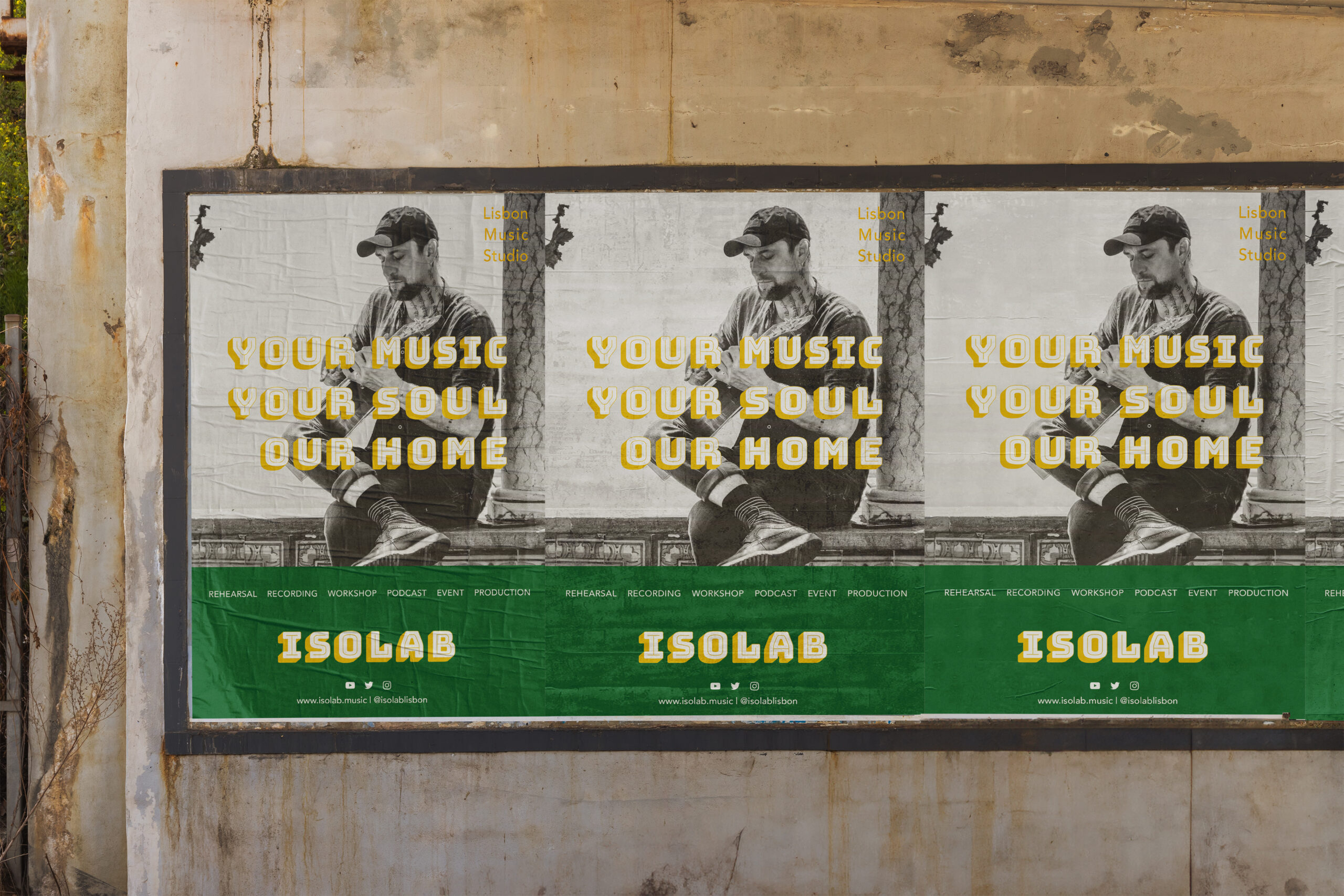
Idea "Playful Font"
I chose Bungee Shade Font because it captures both a sense of playfulness and analog charm. Its bold, three-dimensional design creates a strong visual impact at first glance, making it an excellent choice for grabbing attention.
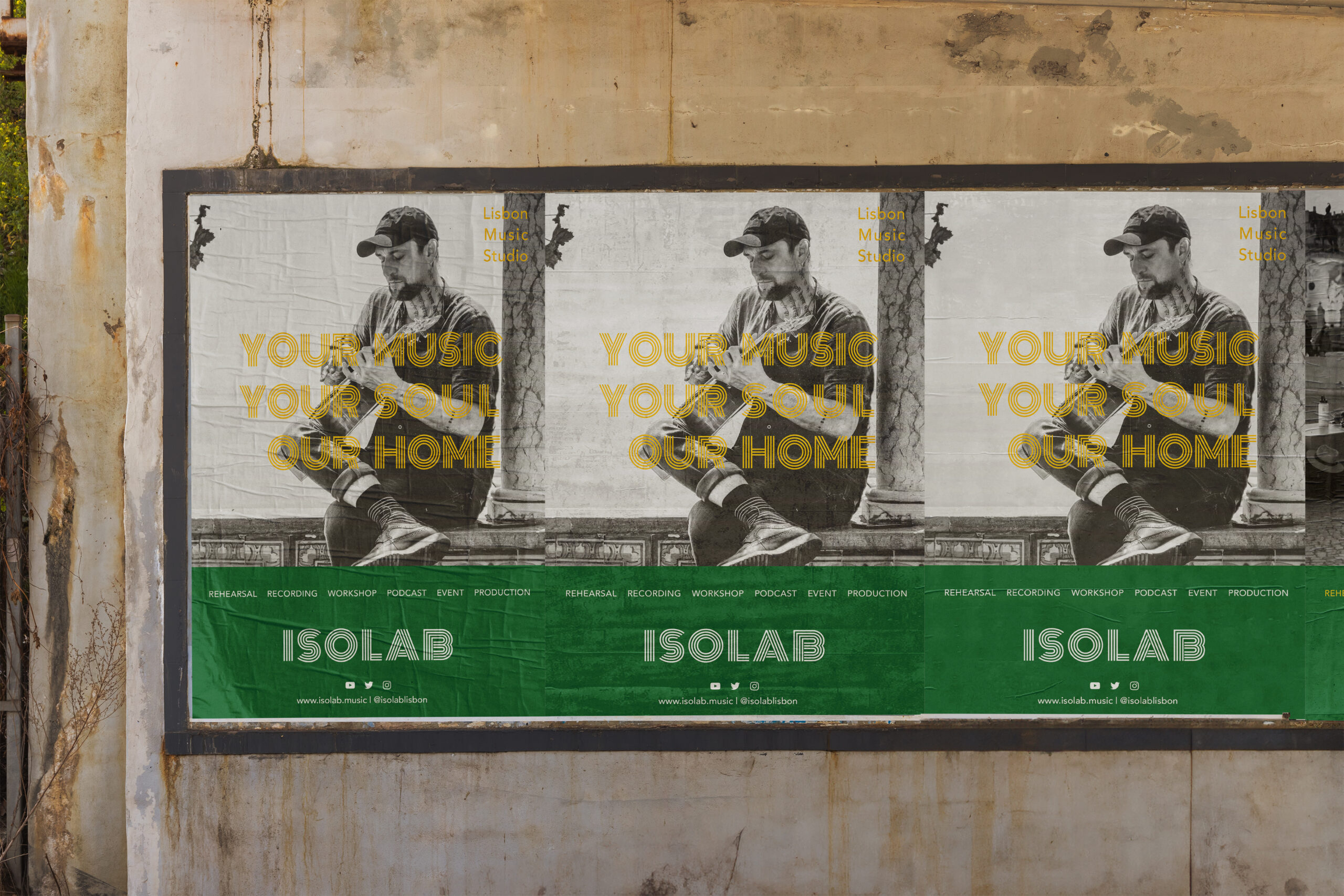
Idea "Retro Font"
Inspired by 70s poster typography, this design was created by combining royalty-free graphics. The goal was to achieve a retro yet geometric aesthetic, blending nostalgia with a modern touch.
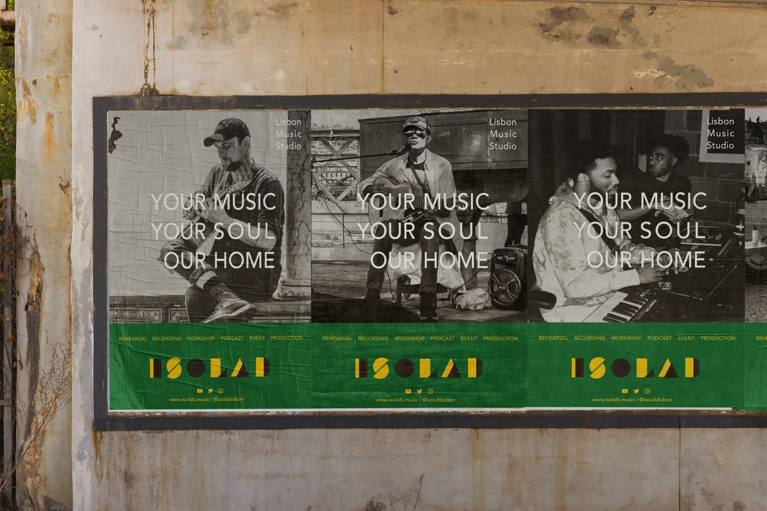

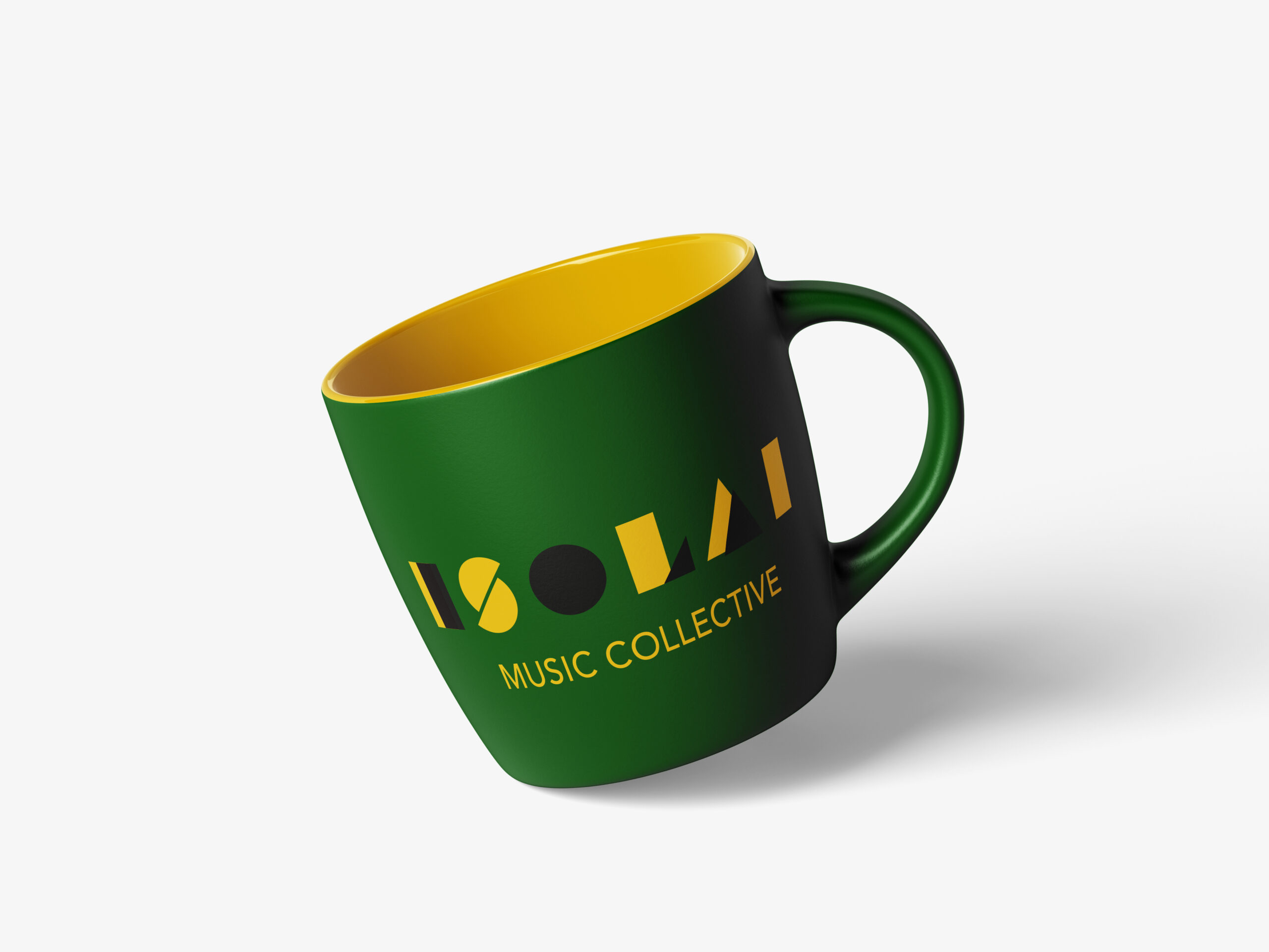
Idea "Geomtric Typography"
Instead of a retro-inspired approach, I chose a different geometric font for this design. It was created using Monoton, which adds a modern and structured feel.
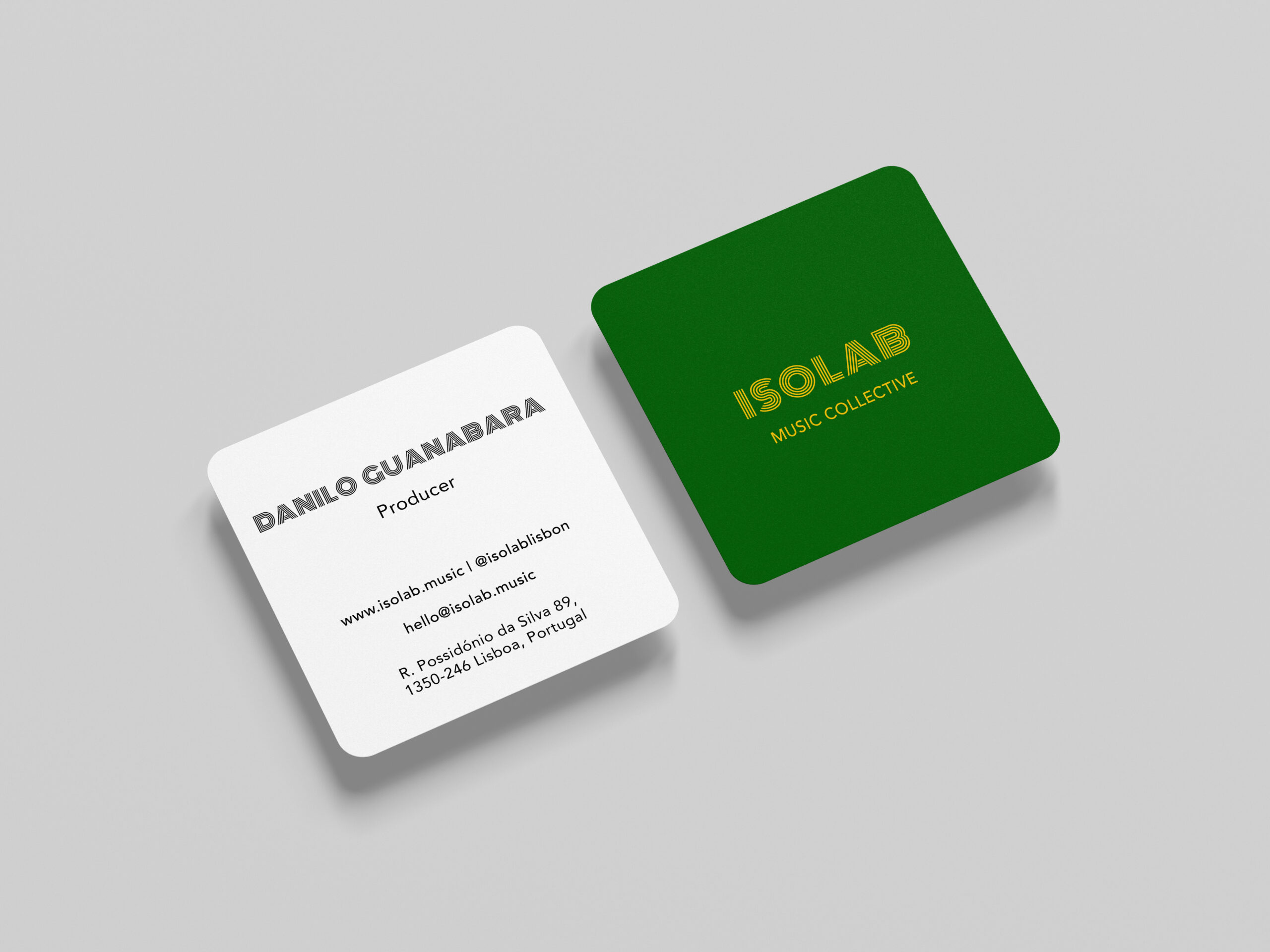
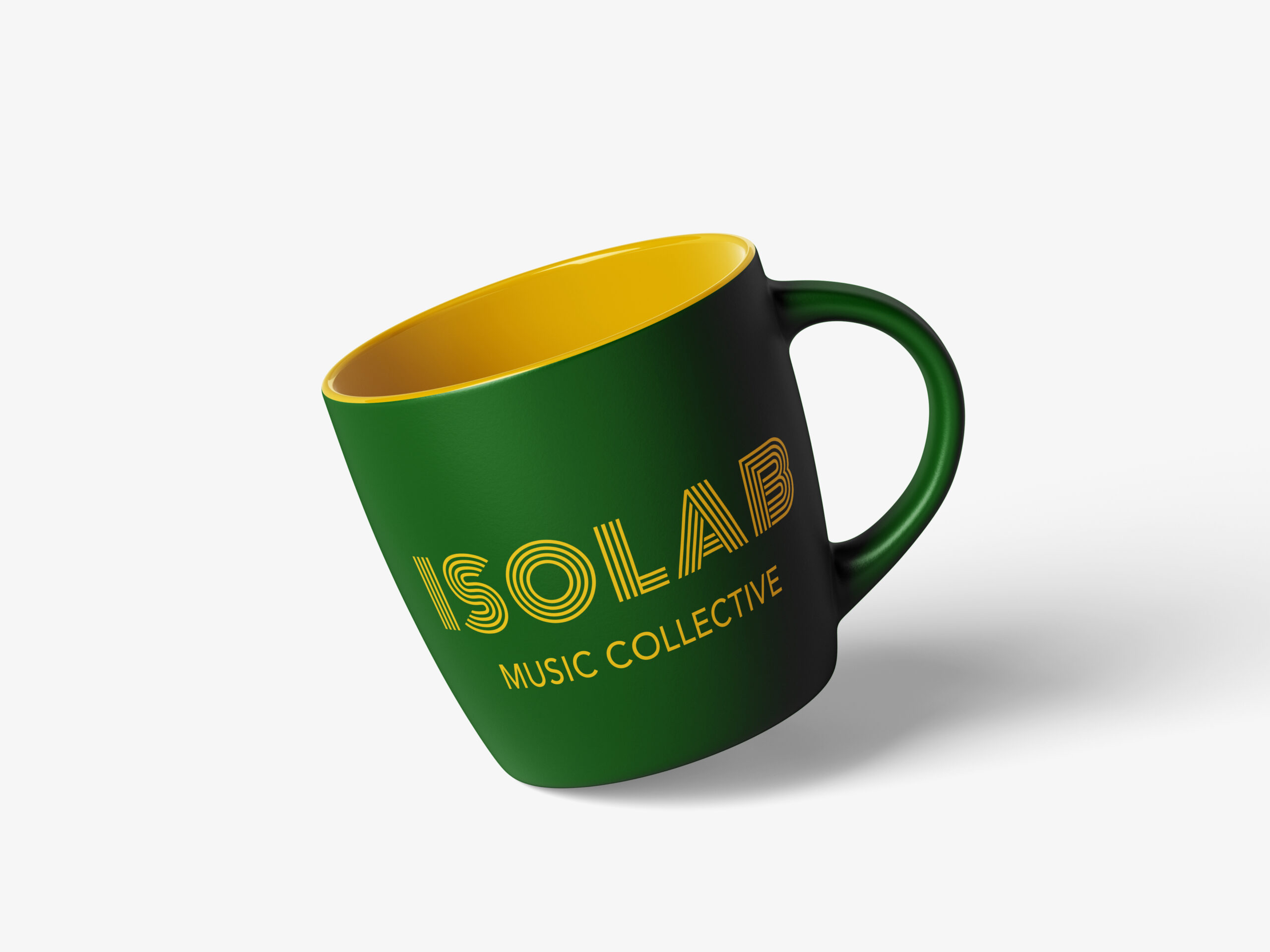
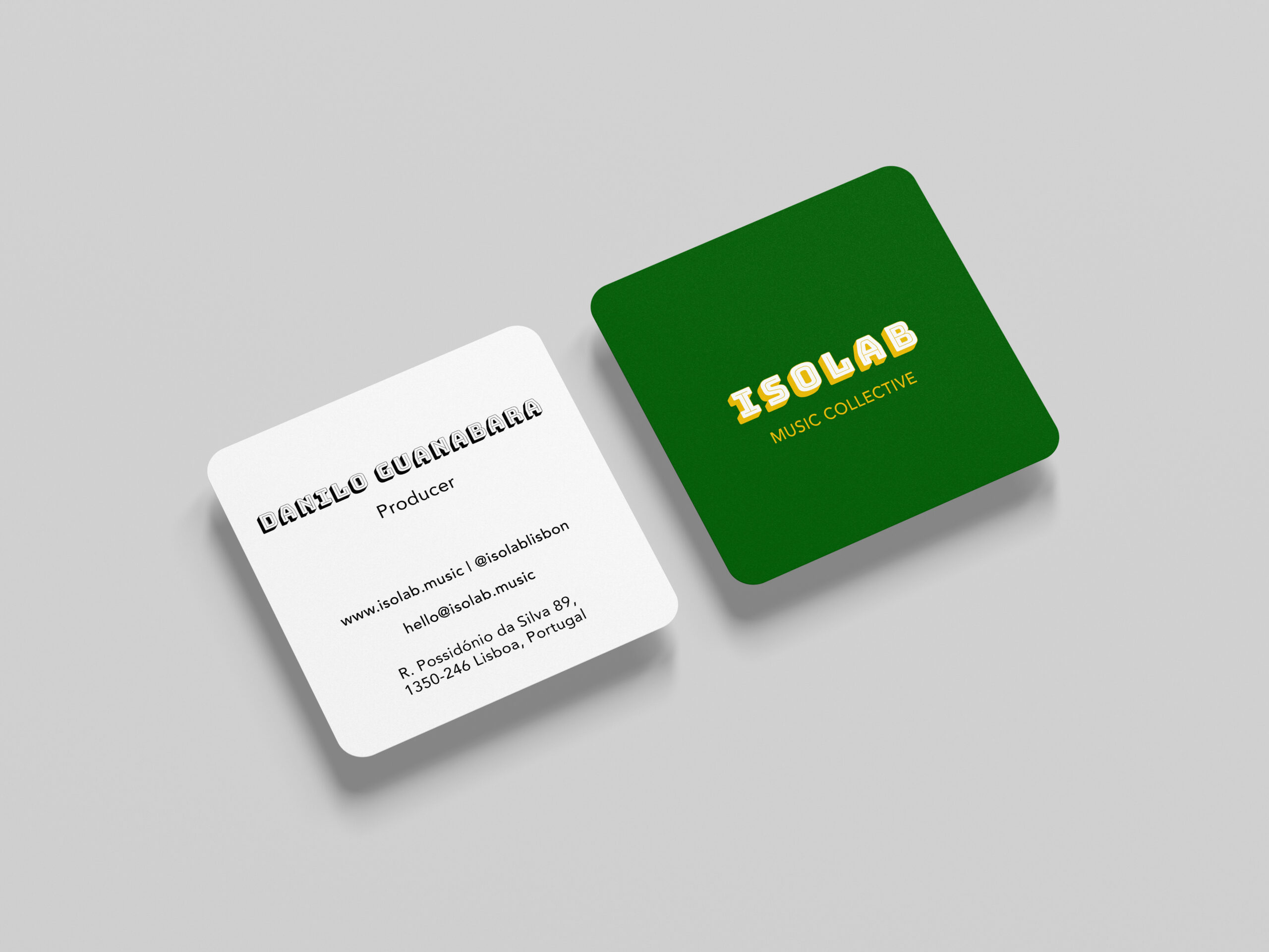
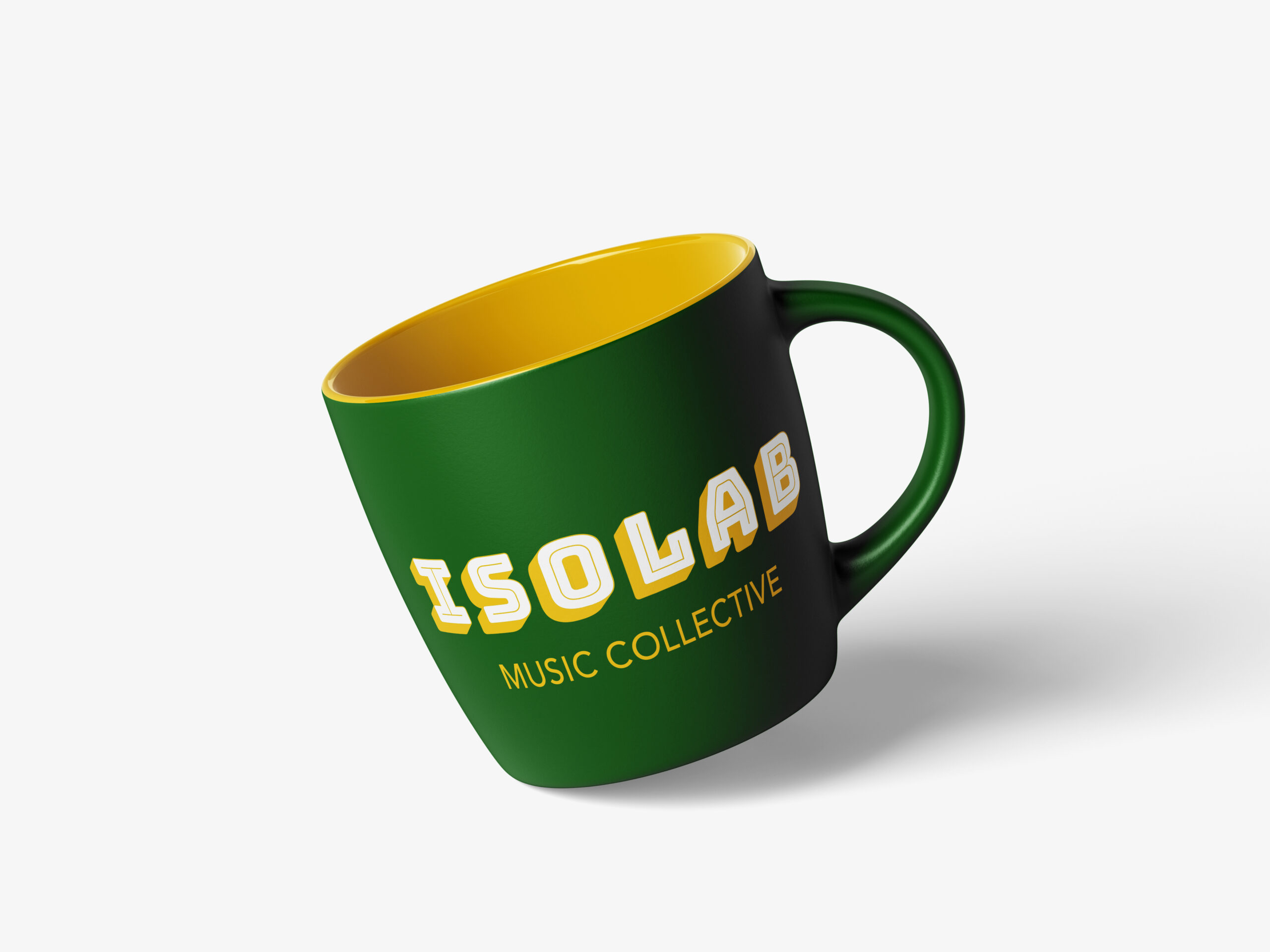
Idea "Minor Update"
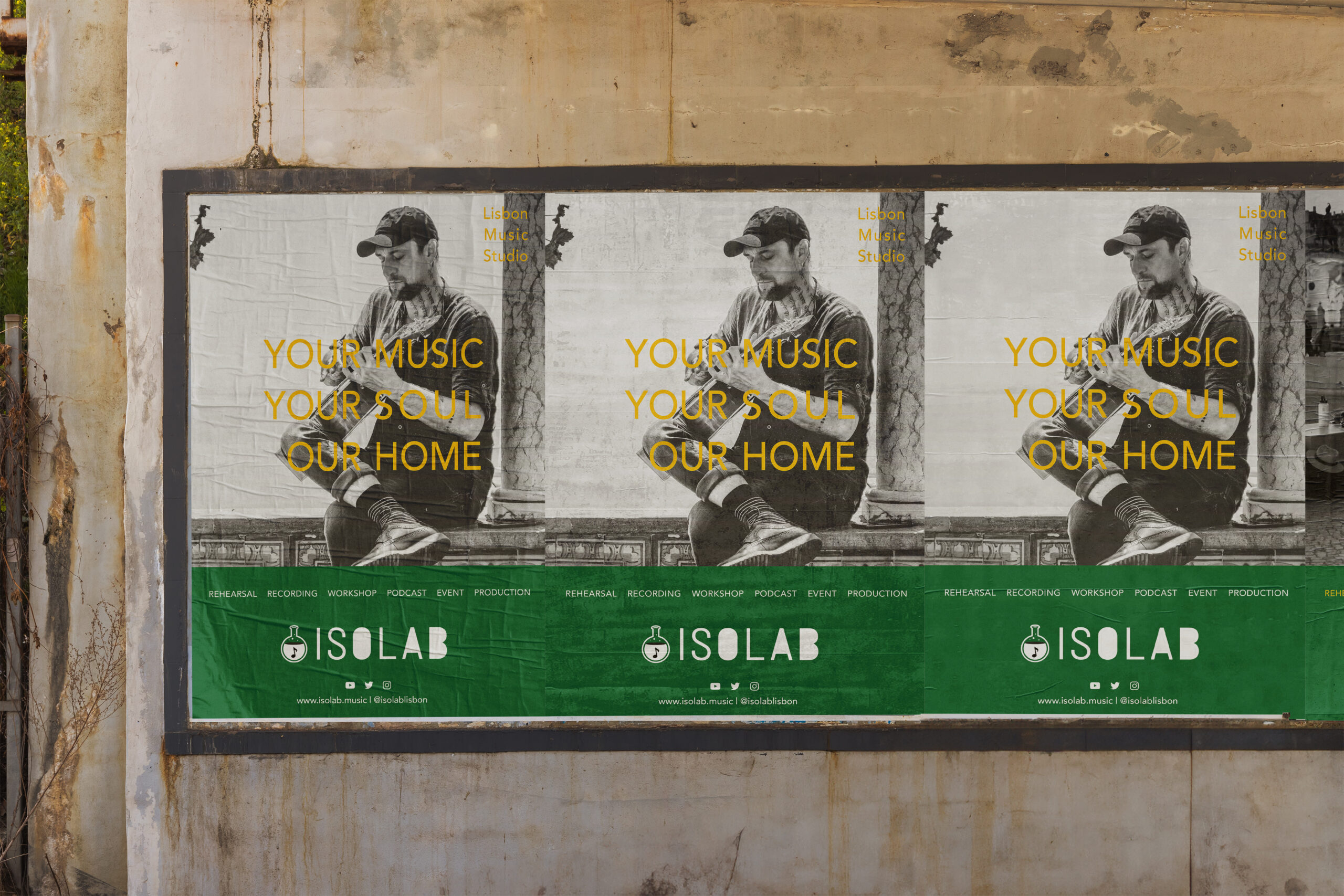
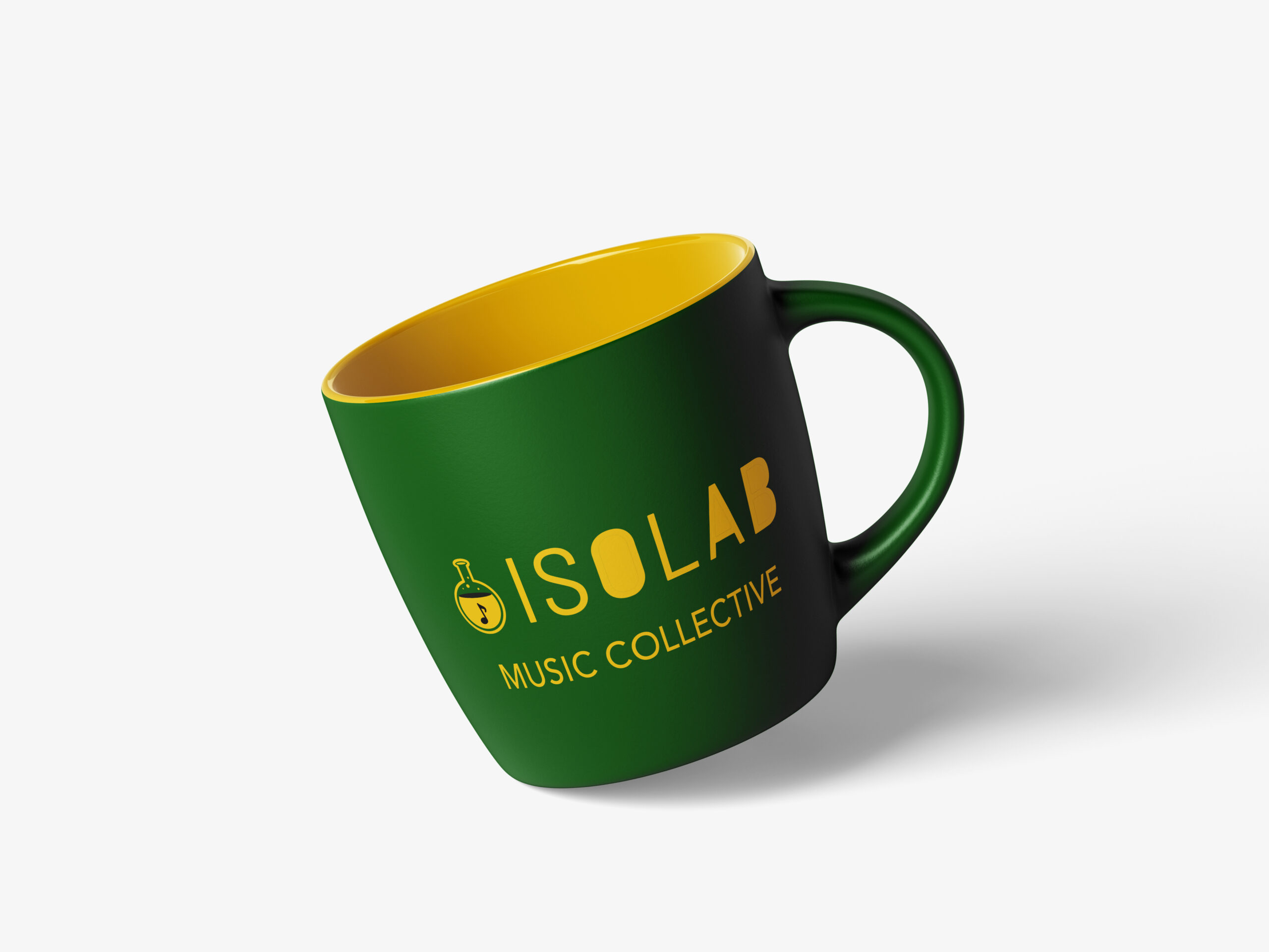
This is a minor update to the current logo. I used the Barlow Semi Condensed font and added a musical note icon to the design, making it more immediately recognizable as a music-related business.

Discussion
I’ve prepared four different font-based design proposals to help define the visual direction.
Next Step:
- First, let’s discuss whether we can narrow down our options from these four.
- If we can select one, I’ll refine the design further by adjusting color variations and typography balance. (At this stage, the graphics are still rough drafts.)
- If we can’t decide yet, I’ll gather more references so we can better align on the visual style everyone envisions.