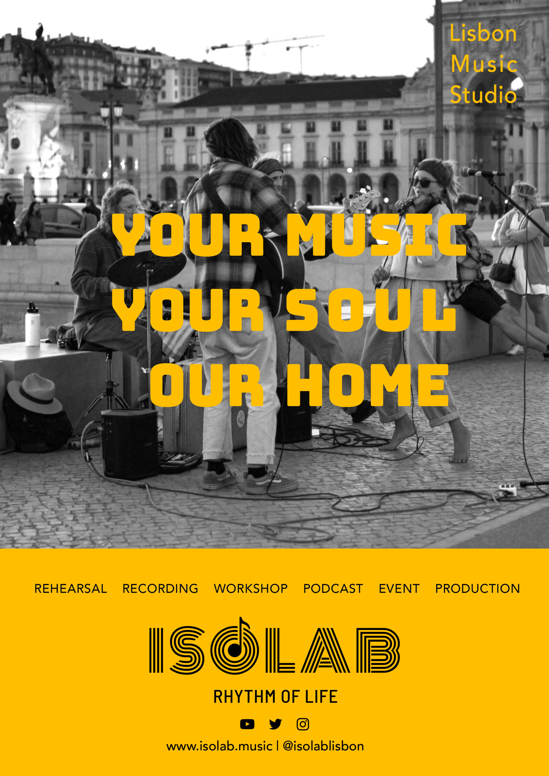
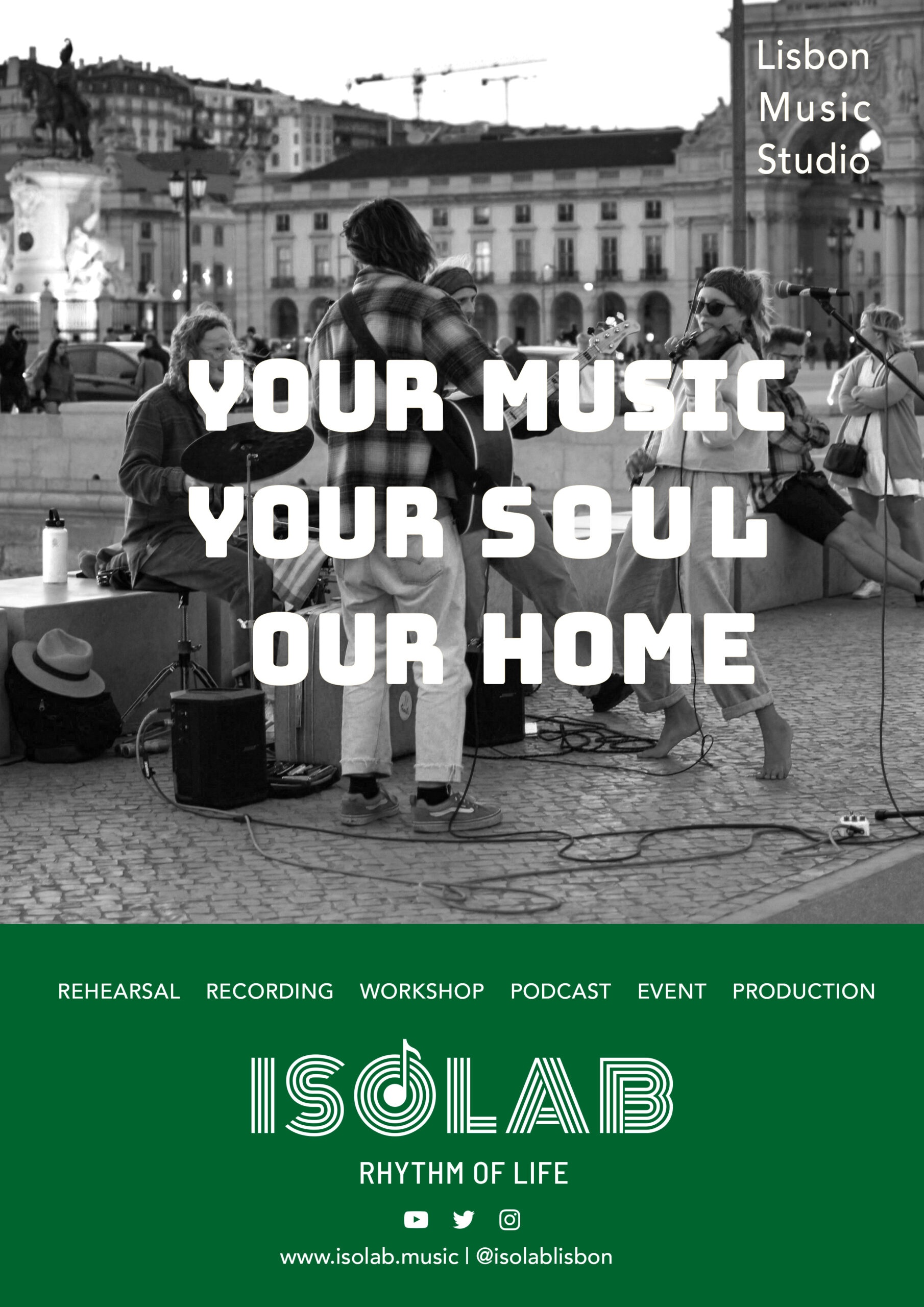
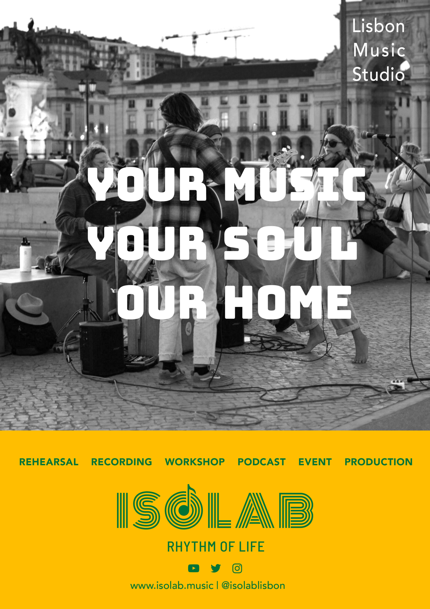
Updated Logo
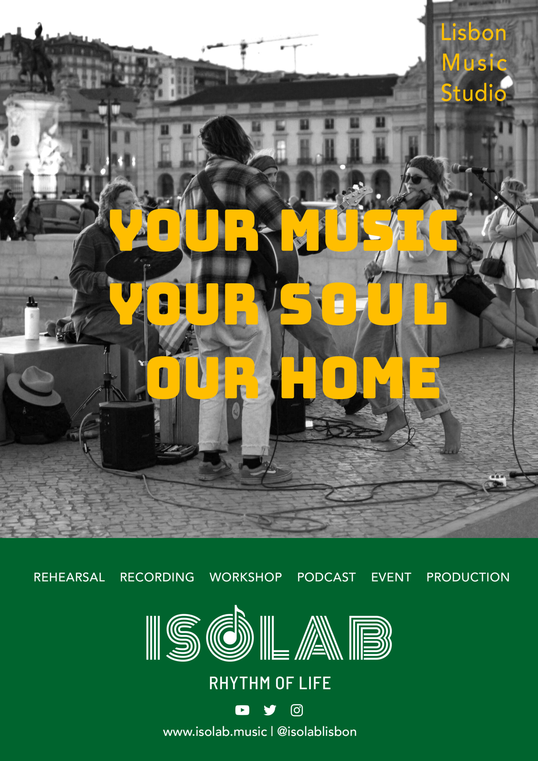
I’ve updated the logo using the geometric font Monoton as the base. Initially, I considered incorporating graphics inspired by vinyl records, but to make it instantly clear that ISOLAB is connected to the music industry, I decided to add a musical note.
Additionally, I felt that having a slogan would help convey a stronger message, so I’ve added a placeholder slogan for now.
Slogan to Compare
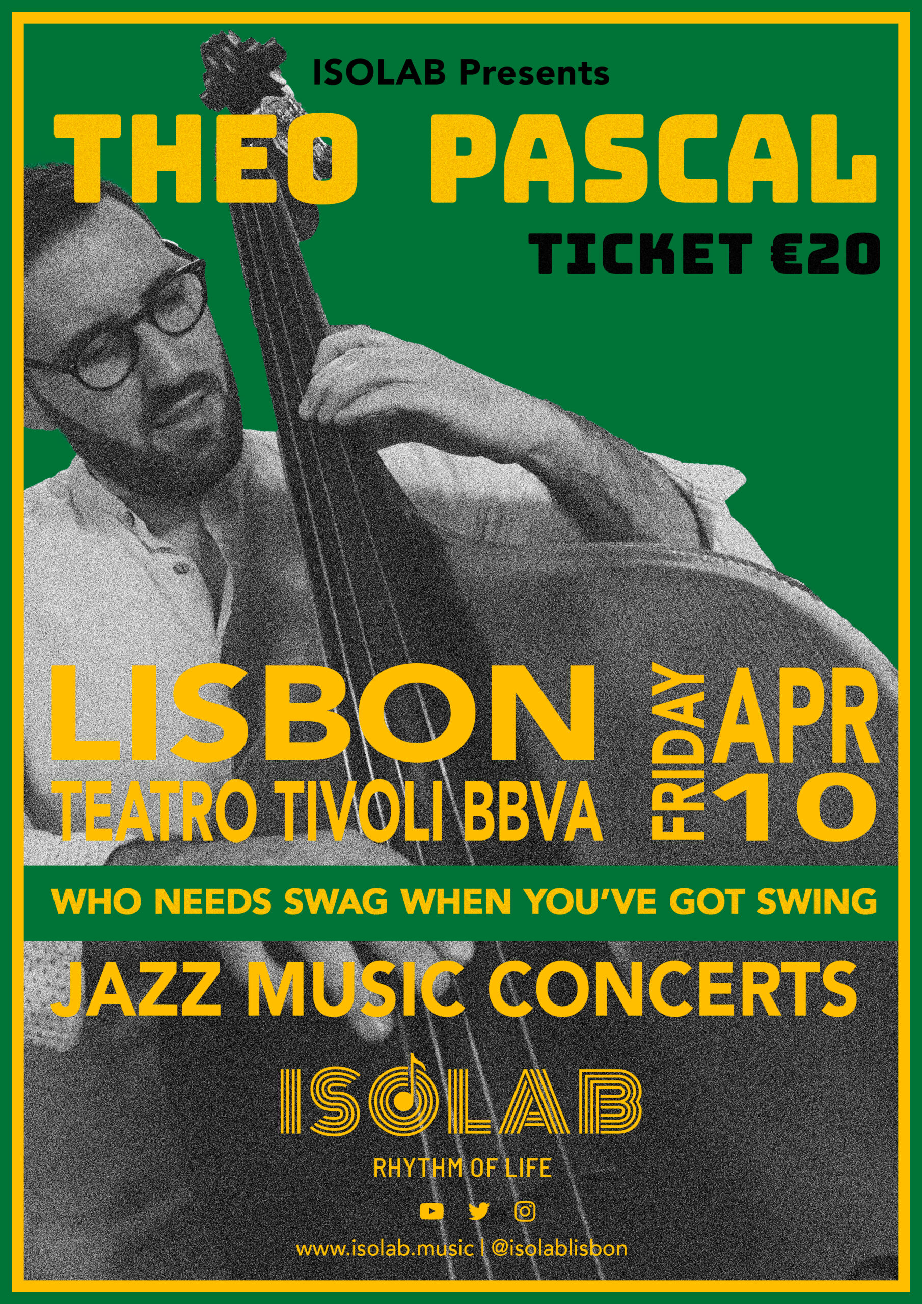
I’ve explored three different directions for ISOLAB’s slogan:
- A lifestyle-driven approach
- A slogan that reflects ISOLAB’s business model
- A call to action
Since complex words may not resonate with everyone, I’ve intentionally chosen simple and easily understandable language. However, the slogan doesn’t necessarily need to be universally understood—it’s more about how it feels.
The key criteria for selecting the best option should be:
- Good rhythm and pronunciation – it should be easy to say.
- Strong visual appeal – it should look great in design.
- Instant connection – it should feel right intuitively.
Let’s discuss and refine from here!
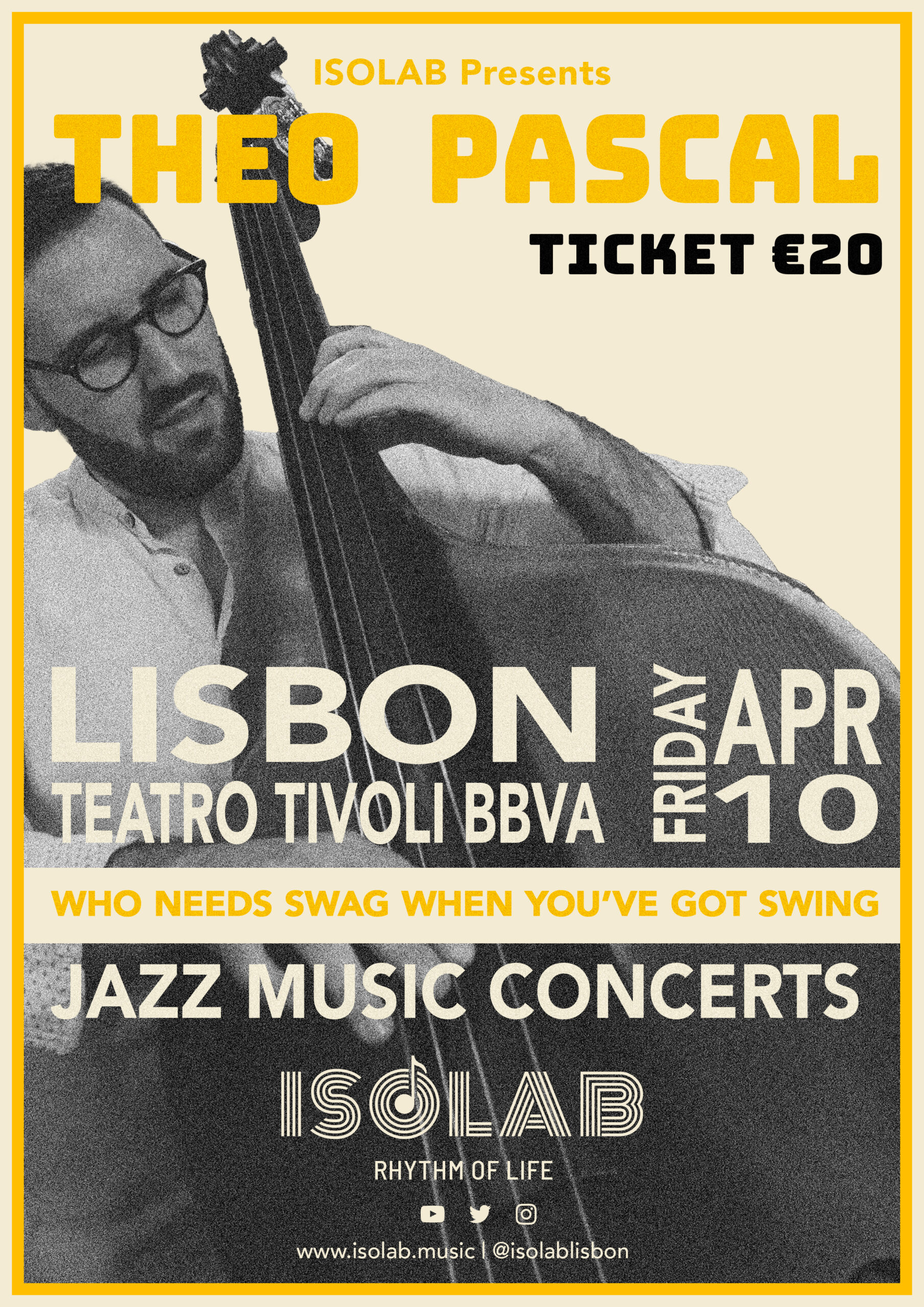
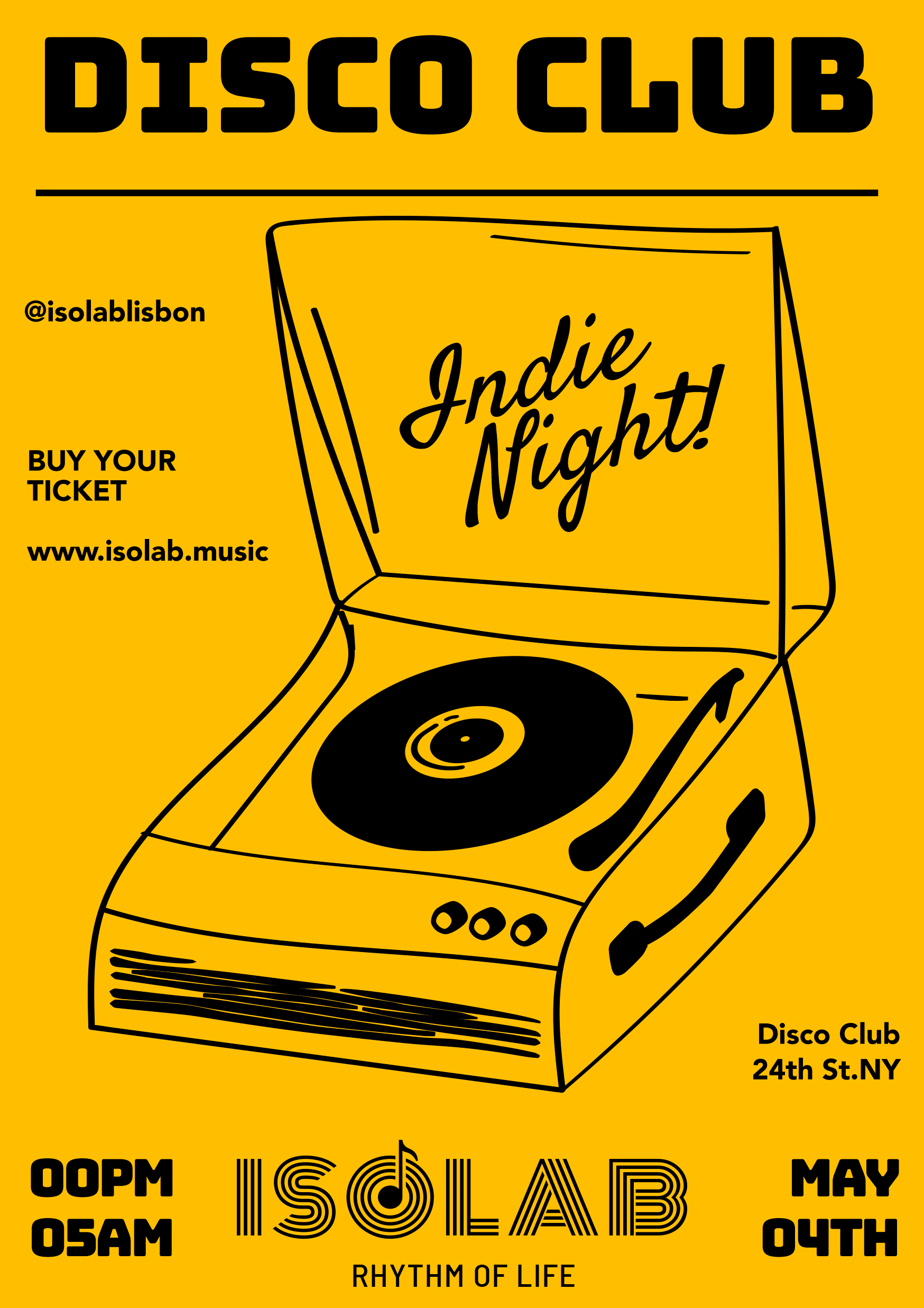
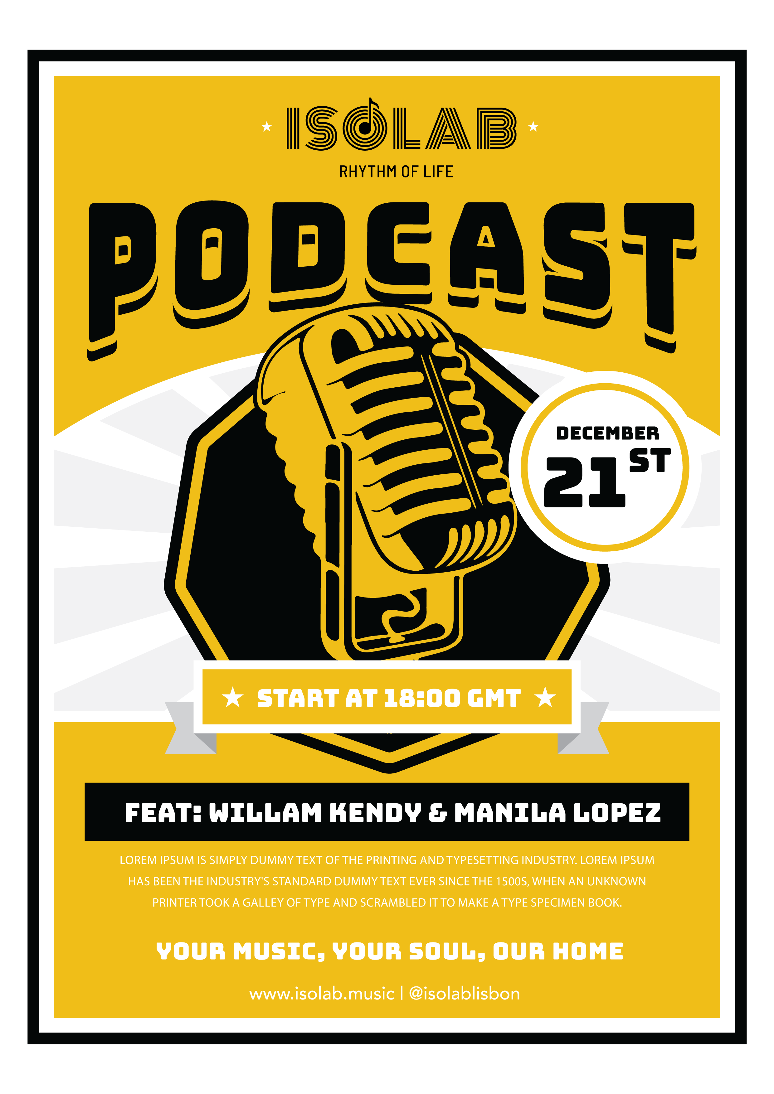
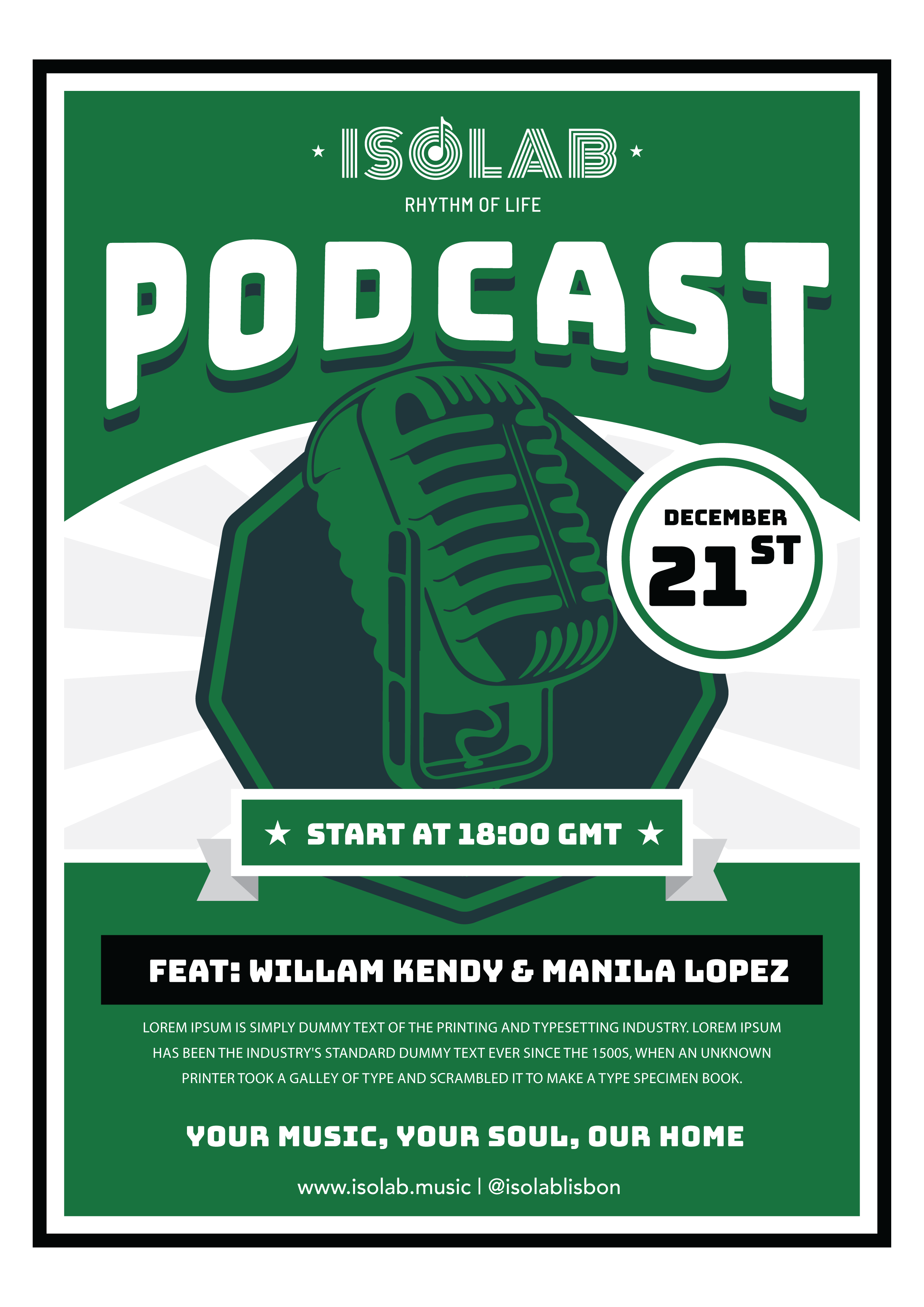
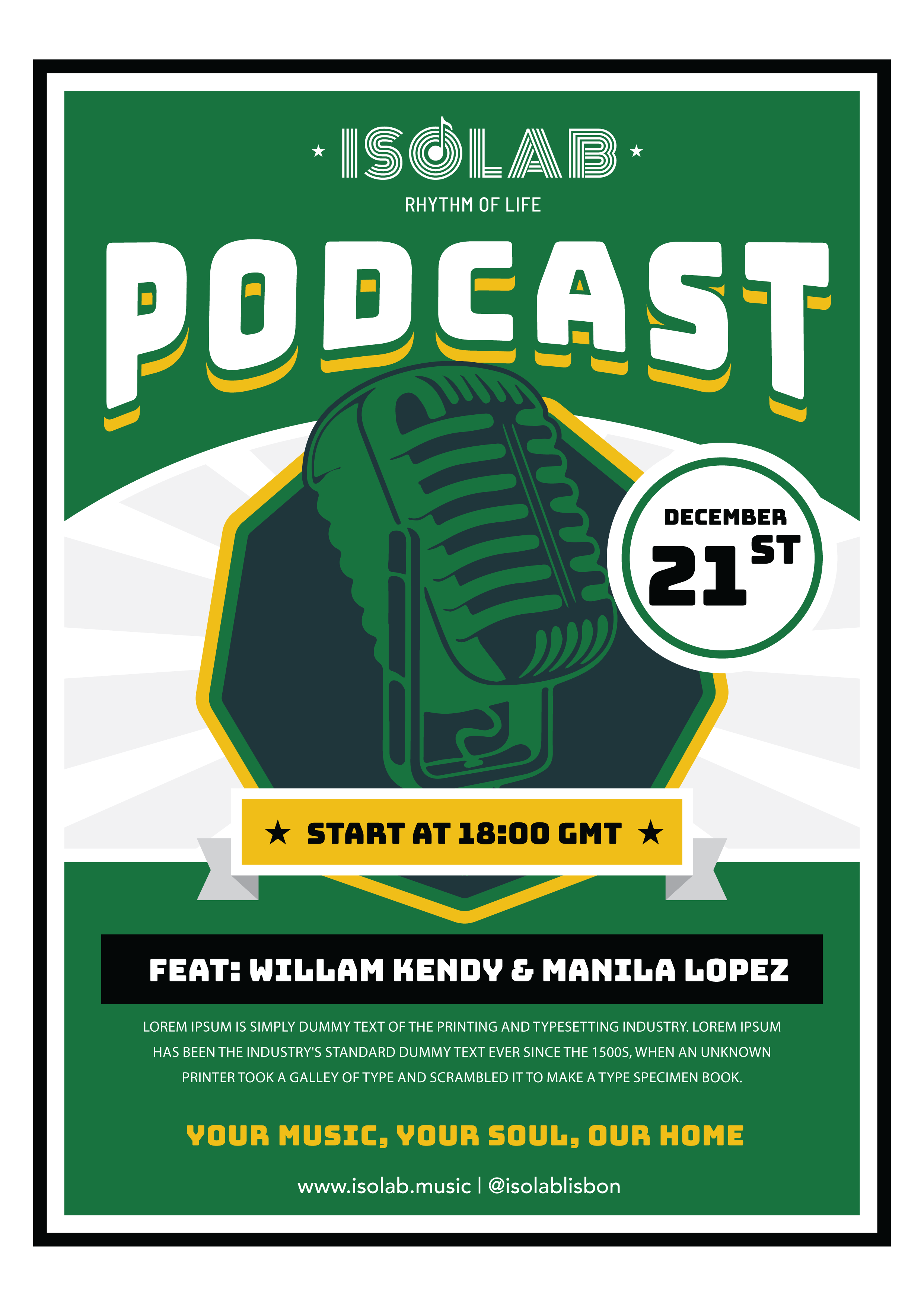
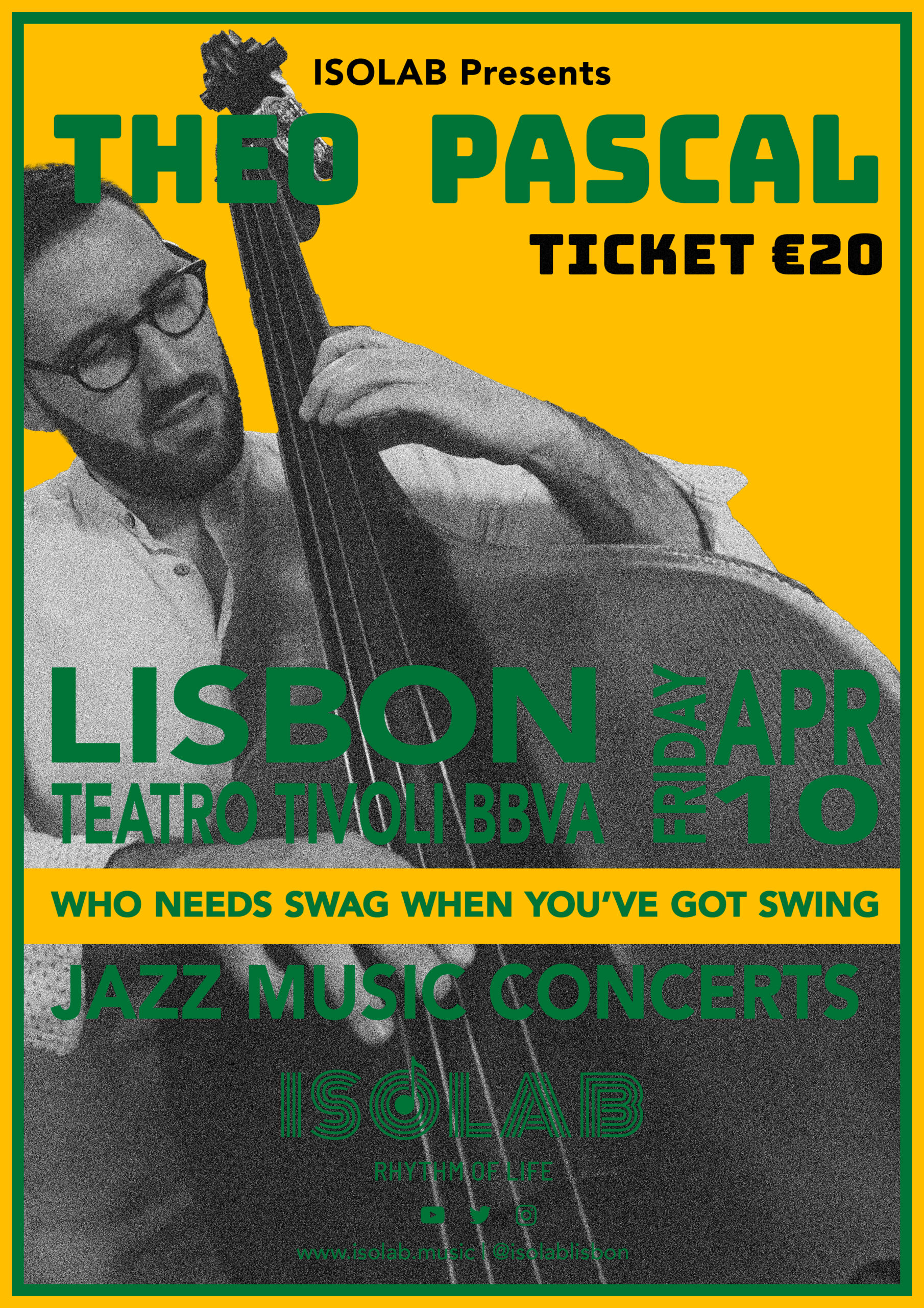
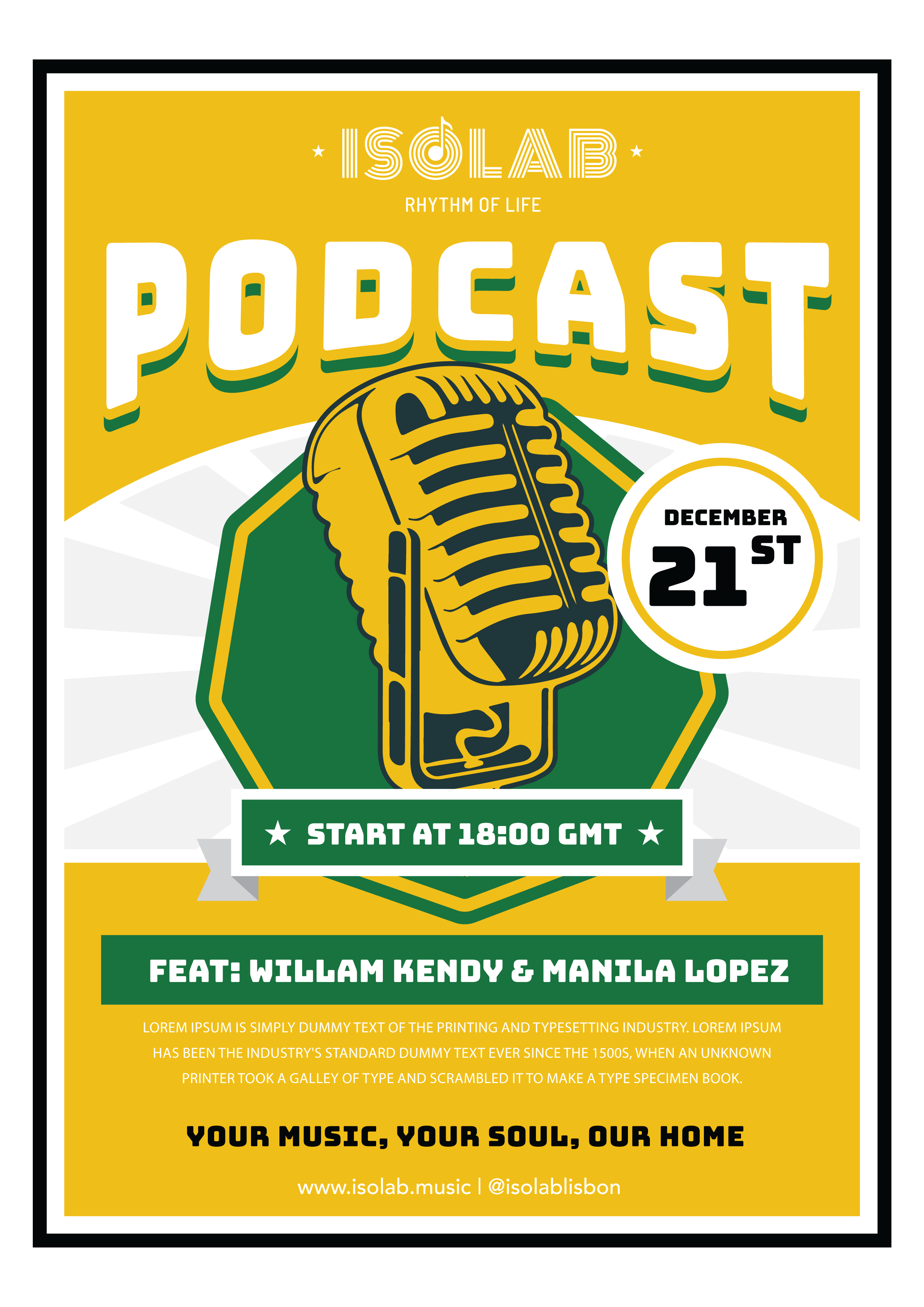
Colour Palette & Graphic Style
We will finalize our logo alongside establishing the brand colors and a basic graphic style. This graphic style is intended as a guiding framework rather than a rigid set of rules that every future design must strictly follow. However, to effectively communicate ISOLAB’s business identity, services, and culture, it’s important to have a consistent visual language. A well-defined style ensures that our visual expressions are cohesive and reinforce our brand’s message, even if individual designs allow for some creative flexibility.
Yellow-Base
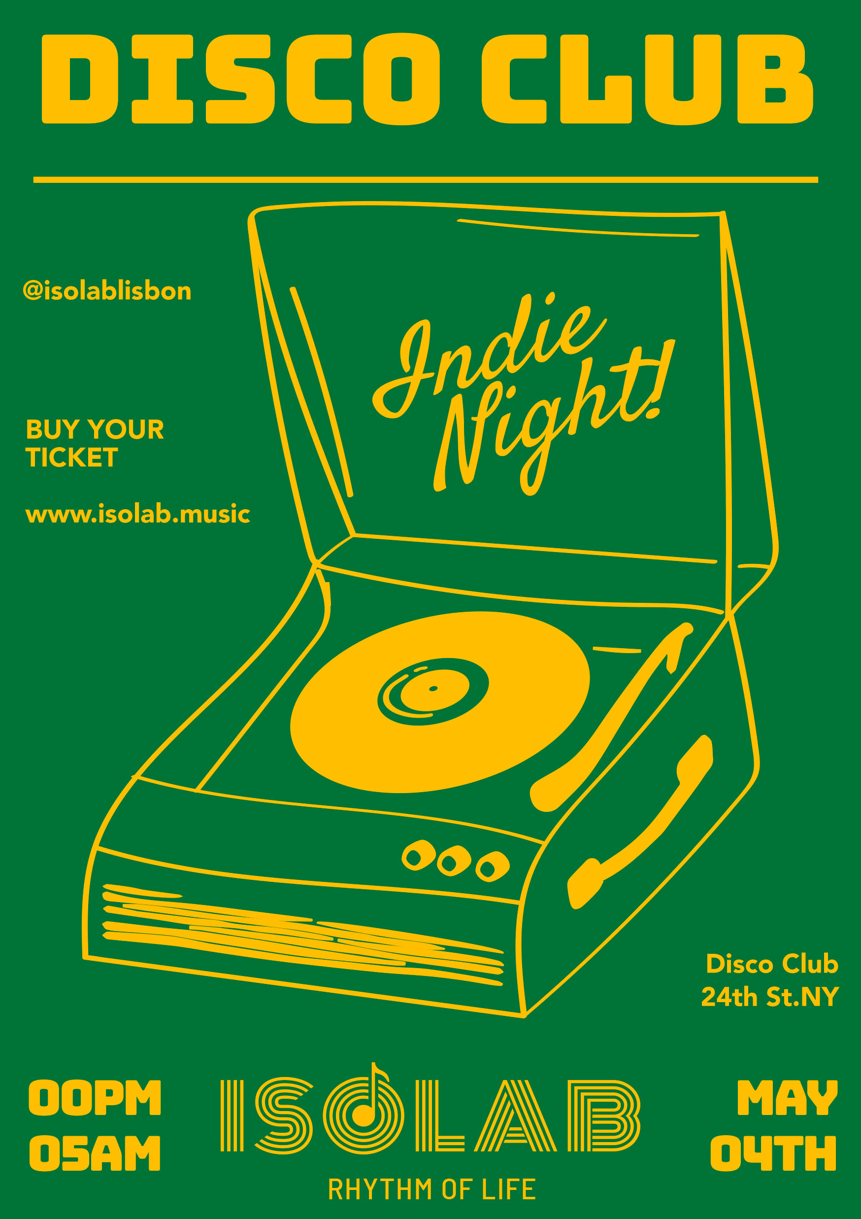
Green-Base
Green(Primary)-Yellow-Base
Yellow(Primary)-Green-Base

Discussion
I’ve created four different color variations based on the Brazilian green and yellow. Personally, I think having yellow as the primary color and green as the secondary color works best. Using two colors makes it easier to convey a sense of brightness and a retro feel.
As for the graphic style, I feel that the Podcast flyer doesn’t quite fit, but the other three seem to be heading in the right direction. What do you think?