Mission & Challenge
Currently, we do not have an editable vector format of our logo. As we begin promoting the studio, we will need to showcase our brand across various media, making it essential to have a vector-based logo file.
To address this, I have manually traced the existing logo image and created a vector version. However, there is still one issue: acquiring the original font used in the logo.
For effective branding, it’s best to use the same font as the logo for website headlines and graphic materials. Ideally, this should be a royalty-free font that we can use freely.
With this in mind, I have created two variations of the logo for consideration.
V1. Minor Change
V2. Font Change
In this version, I have changed the font. The font used in the current logo is not royalty-free, meaning its purchase and licensing costs vary depending on the media where it will be used.
To address this, I selected a similar font that maintains the original look while also enhancing the logo’s impact.
Font Comparison
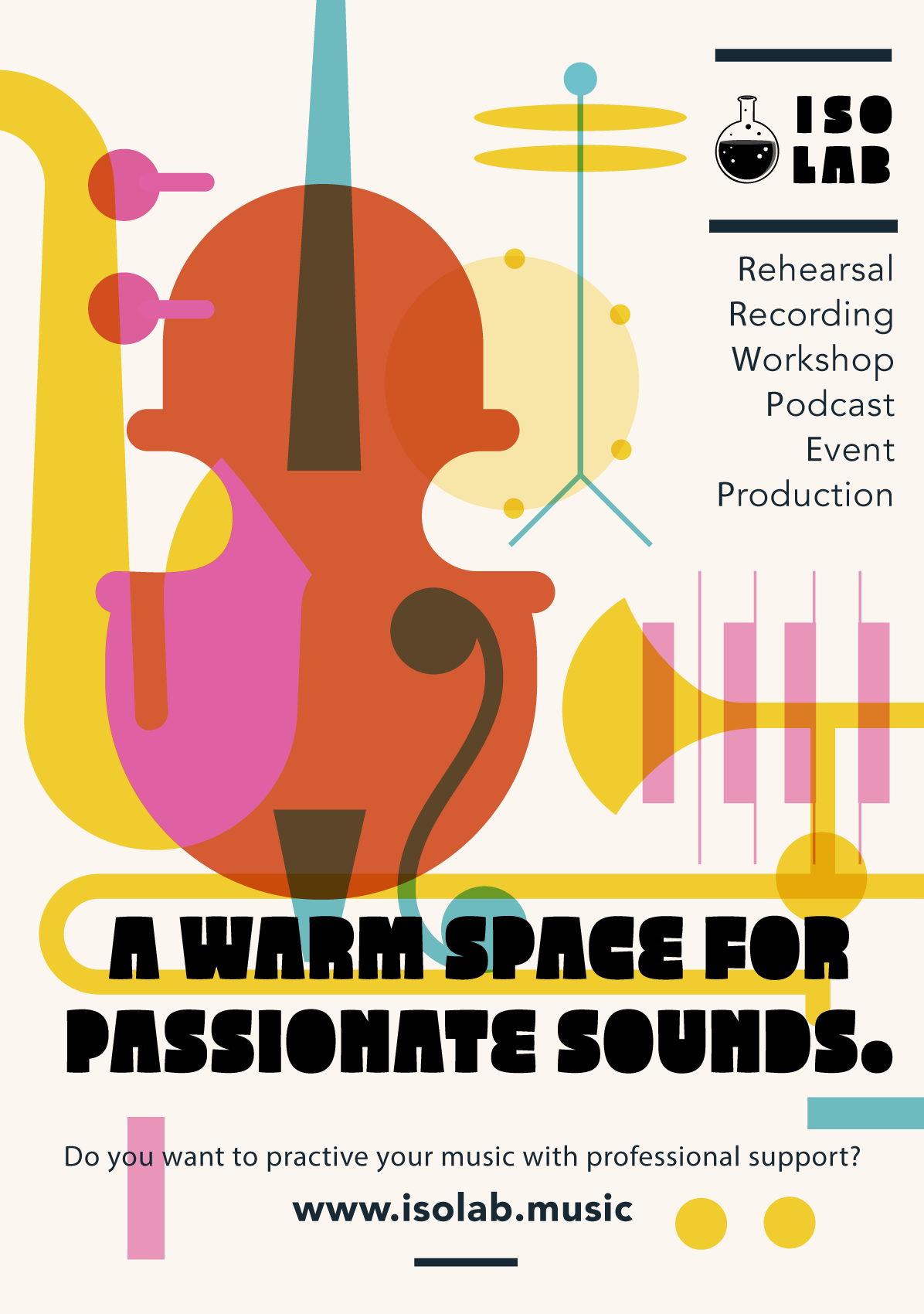
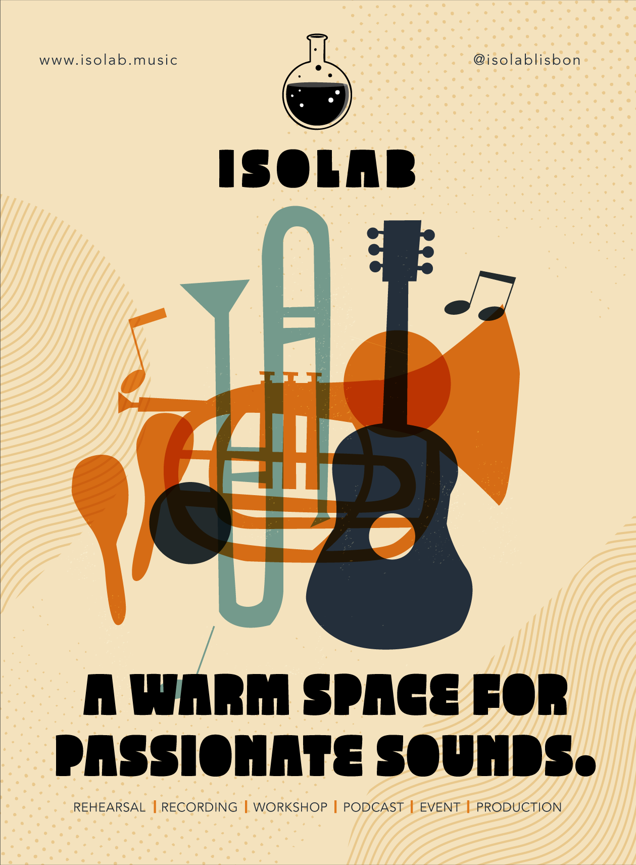
Although these are just two logo variations with different fonts, typography can significantly impact the overall impression. To illustrate this, I designed a flyer showcasing the differences.
I’ve created three versions in total for comparison.

More Different Fonts, Icons
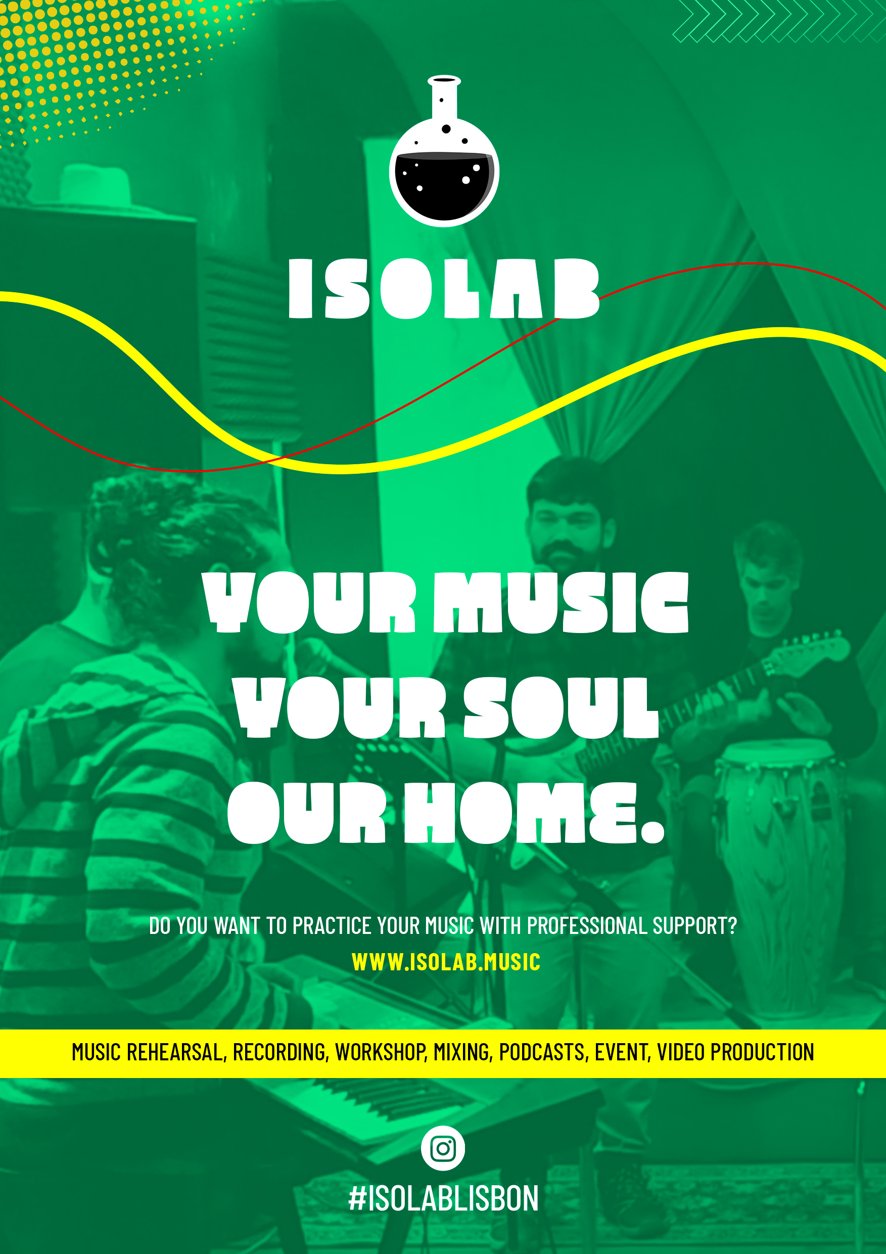
The name ISOLAB is likely to make many people think of a research institute or laboratory. In fact, there are several research labs around the world with the same name. Additionally, the current logo, which features a test tube as an icon, further reinforces this scientific/laboratory-like image. To address this issue, I have created several new logo variations with different icons and typography to better align with ISOLAB’s identity.
Discussion
Before implementing the homepage, we need to define the desired atmosphere and overall impression. Among the key elements shaping this, typography has a significant impact on the look and feel.
Discussion Points:
- Typography for the logo – What typeface should be used to best represent the brand?
- Logo variations and usage rules – At least two versions (horizontal and stacked) are needed for flexible placement in graphics.
- Color guidelines – Defining a consistent color scheme for branding.
- Overall tone and style – Should the design be monochrome or colorful? If monochrome, should it be white-based or black-based?
These elements will help create a cohesive and visually strong homepage.
Yoshi's thoughts
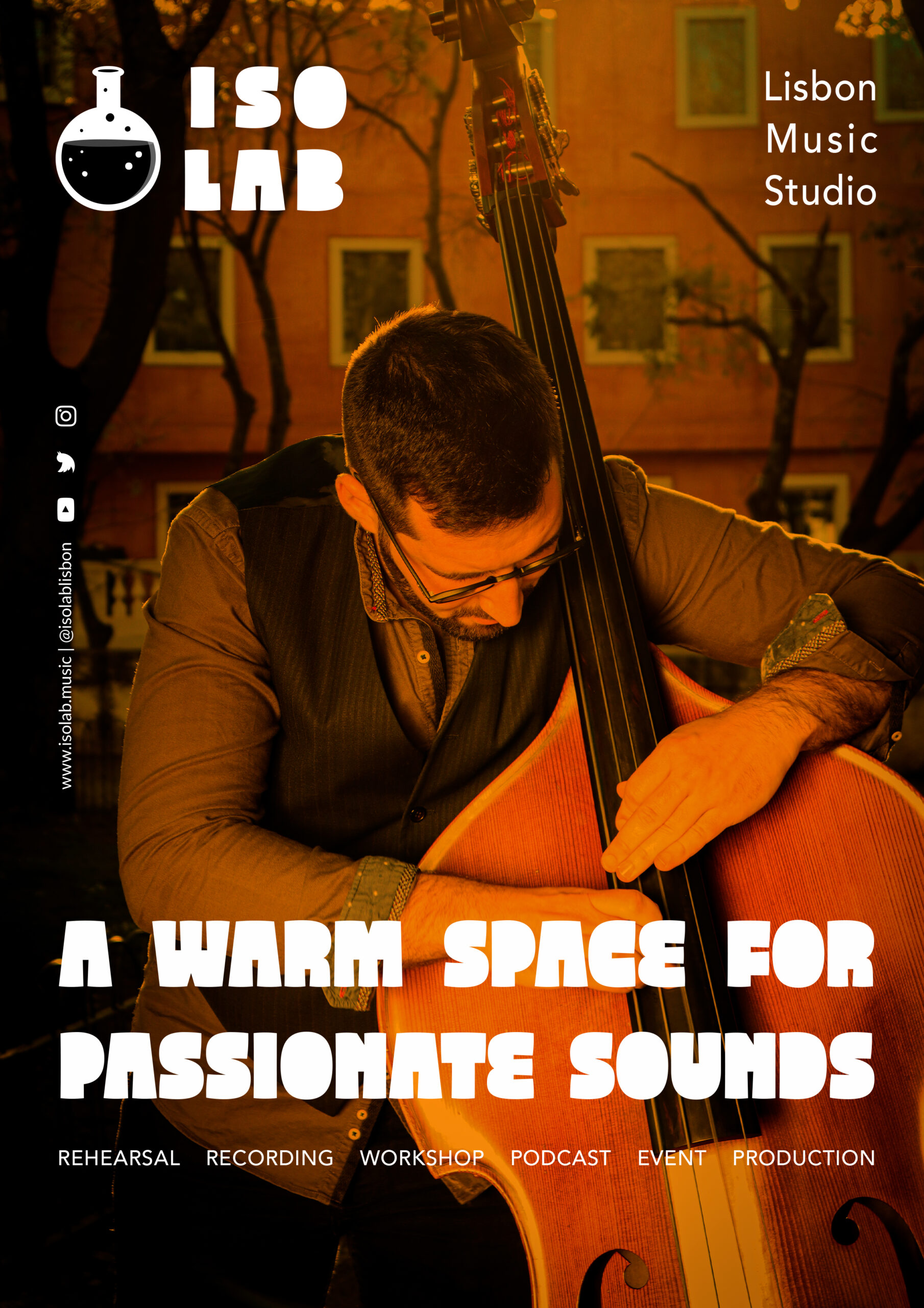
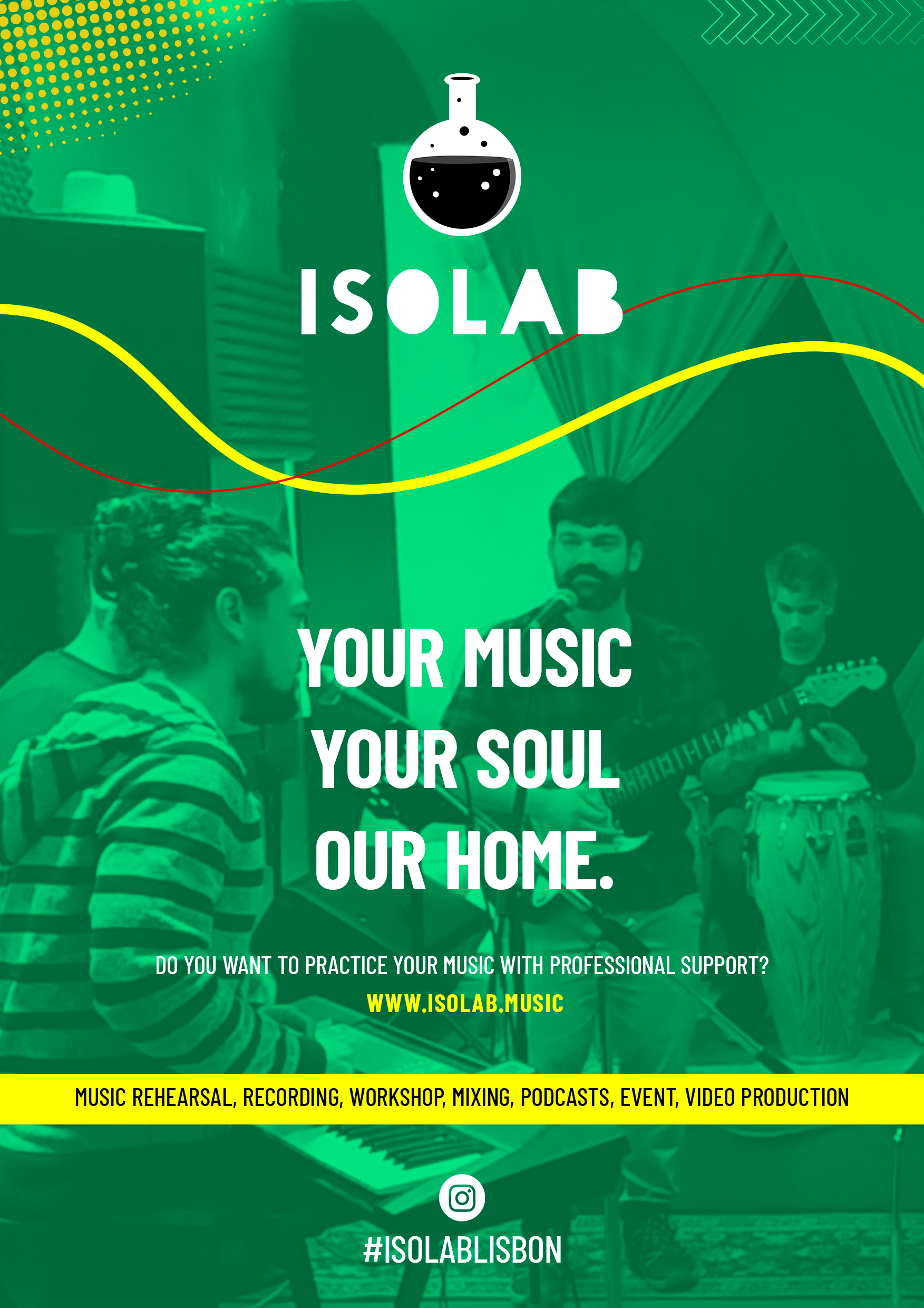
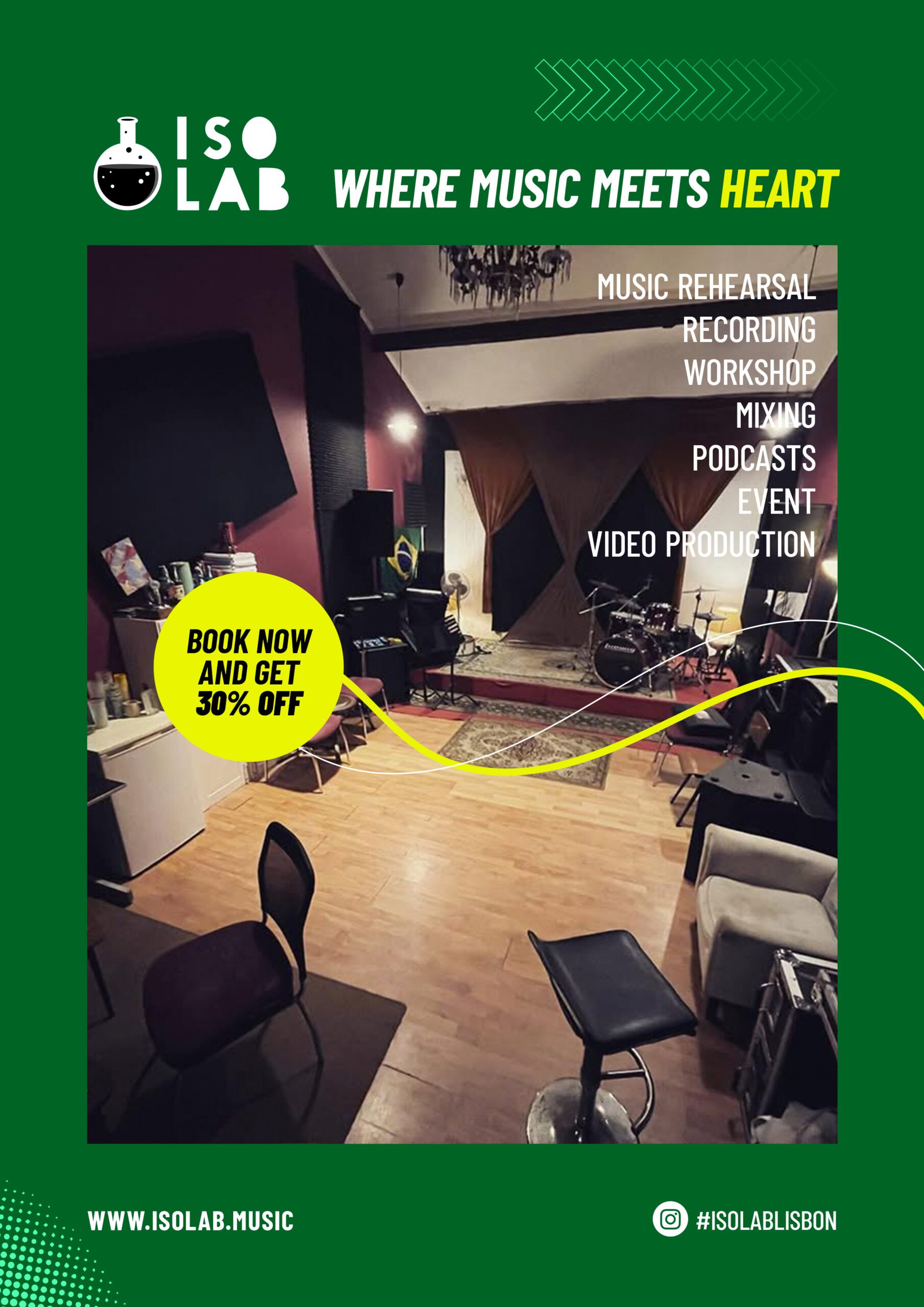
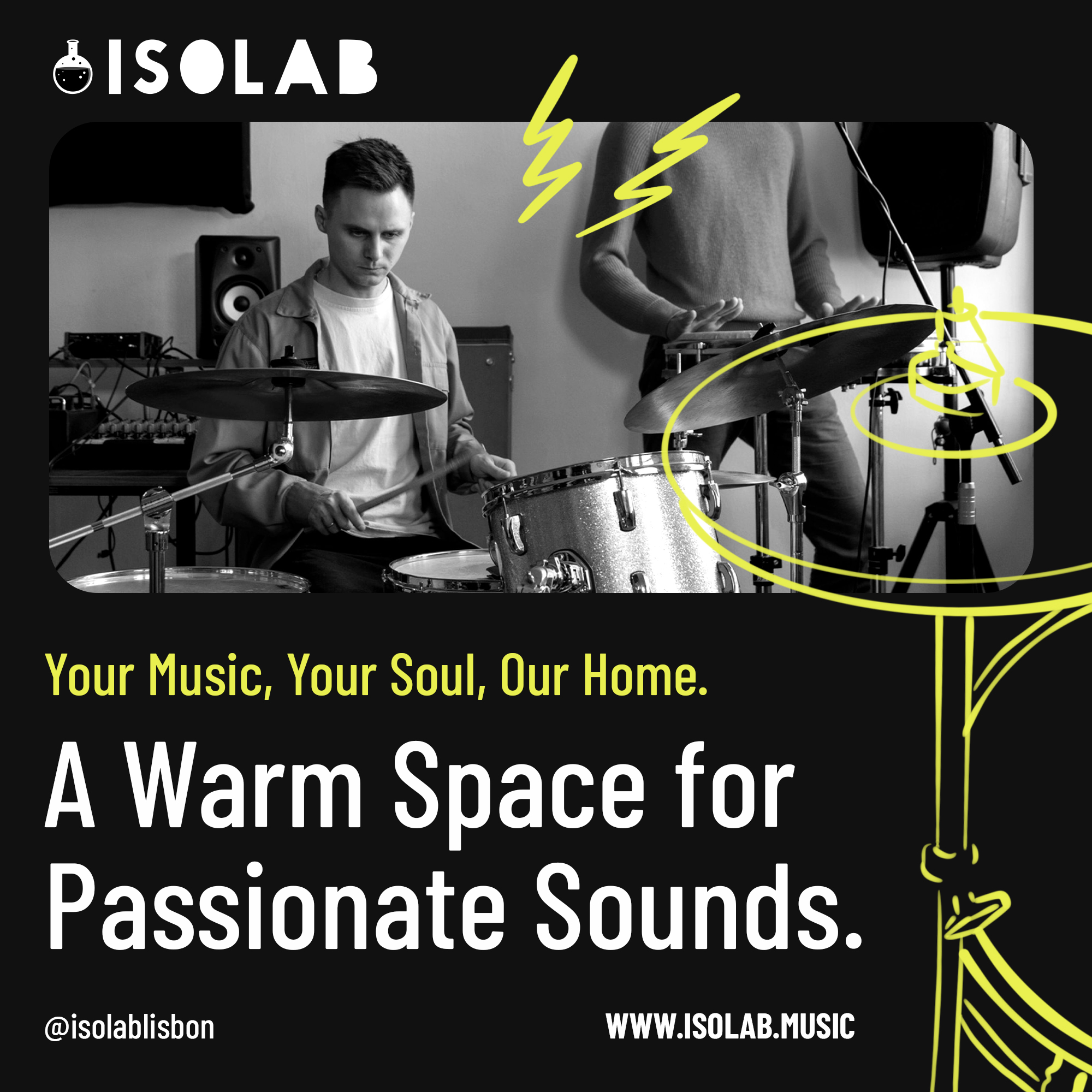
While researching music studio websites from different countries, I noticed a common trend—most studios rely heavily on equipment photos as their main visual communication, emphasizing their facilities as their key differentiator.
For a recording studio, highlighting equipment makes sense, but I believe this is an outdated business mindset. Today, with streaming platforms and YouTube dominating music promotion and production, having top-tier equipment is no longer essential for success. There are countless ways for musicians to thrive without relying on expensive gear. Instead, I strongly believe that success comes from human connections, collaboration, and the ability to work effectively with others.
That’s why I think our visual communication should focus on people, not just the studio space or equipment. There are likely other studios in Lisbon with better facilities or easier access, but what will make people want to come to our studio is the experience and atmosphere we create.
For our website, social media, and overall marketing, we need to make sure that before even stepping into the studio, people feel inspired and excited to visit. The key question is: What kind of visual communication will evoke that feeling?
I want us to thoroughly discuss this and find our starting point for an answer.
Test Creative Video
Test Creative Graphics